UX decision: Three entry points, not one search bar
Google Maps has one paradigm: search → route → follow. User research showed three distinct walking intentions that needed different interfaces:
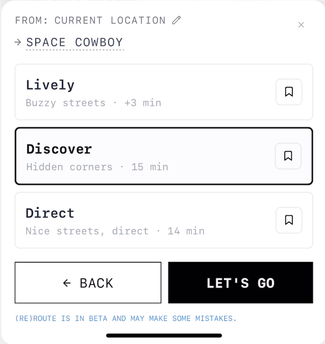
GO
"I know where"
Destination-driven
Search bar + autocomplete. But instead of one route, the AI generates 2–3 alternatives scored by mood (calm, scenic, lively) using 119k street segments. The user chooses the vibe, not just the speed.
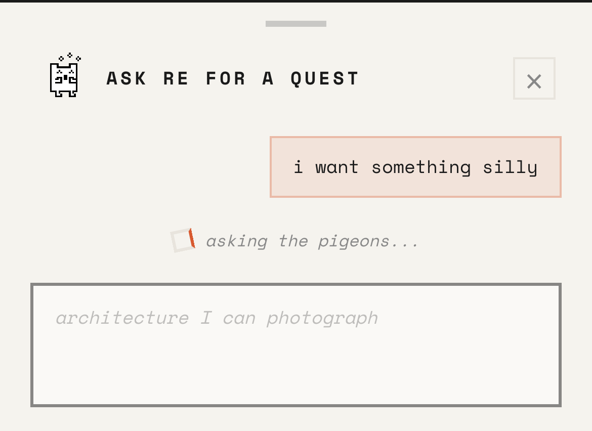
EXPLORE
"Help me decide"
Mood-driven
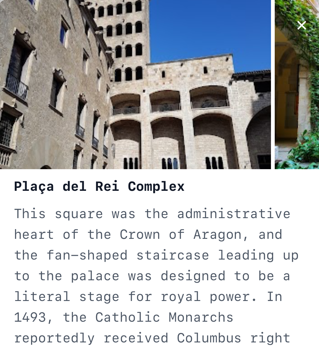
Natural language input: "artsy date night" or "calm walk by the beach." An LLM orchestrator classifies the query into 6 action types, then routes to specialised executors, each with a tailored UI pipeline.
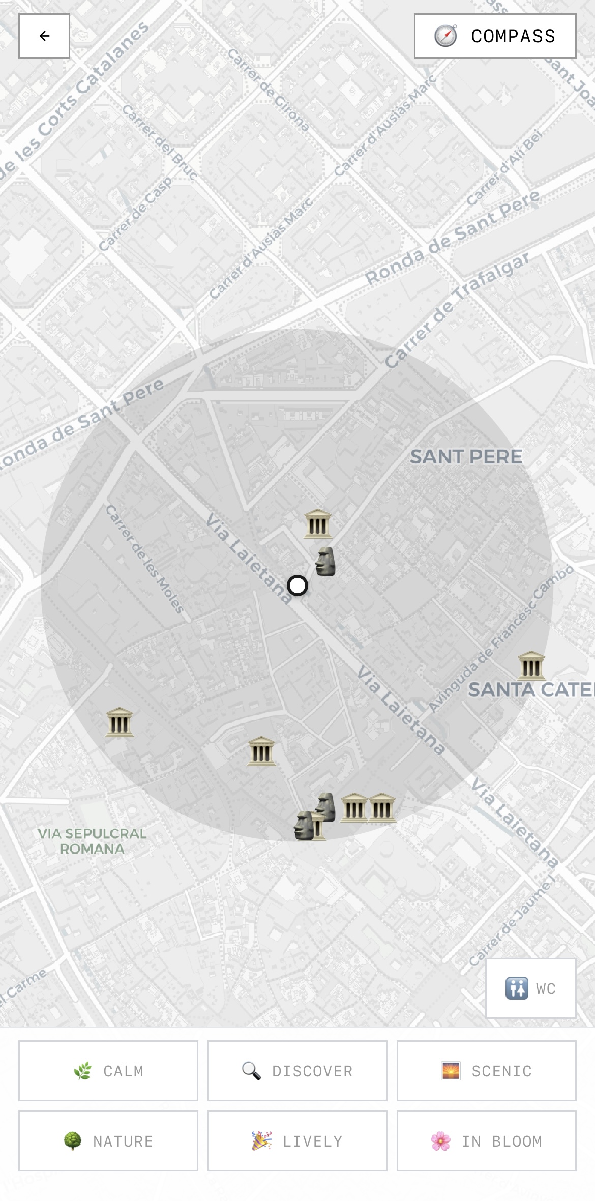
WANDER
"Just walking"
Screen-minimal
No search bar, no destination. A compass-oriented map showing curated POIs within 300m, refreshing as you move. Mood filters (calm, discover, scenic, nature, lively) shape what appears. The first seed of screen-minimal design.

Design logic
Three entry points reduce decision paralysis. Instead of an empty search bar that triggers the Google Maps mental model, users self-select their intention level. This guides both the UI they see and the AI pipeline that runs.